Visualizing Feature Selection in Breast Cancer Diagnosis using NetworkX and Pandas
Using pandas, scikit-learn, and NetworkX to explore data, extract features, and visualize data.

Introduction
This builds upon a previous article, which showed us how to extract features from the breast cancer dataset using scikit-learn. This article shows an alternative for obtaining the most relevant features using a Random Forest Classifier instead of f_regression.
We also explore the dataset a bit using pandas, and show an example of graphing feature values with a matplotlib scatterplot.
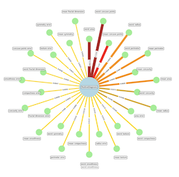
Finally, we create a NetworkX graph that shows the features and their influence on a positive diagnosis. Each edge between a feature and the Diagnosis node has a weighted line thickness, as well a color palette to denote their relative importance.
Breast Cancer Dataset
As a data engineer/scientist interested in the healthcare domain, I often find myself exploring datasets to gain insights and understand the relationships between various factors and disease outcomes. Today, I want to share with you a cool way to visualize the importance of different features in predicting breast cancer diagnosis using the sklearn.datasets.load_breast_cancer dataset and visualizing it using the NetworkX library in a Jupyter Notebook. This dataset has 30 feature columns, so it it is perfect for feature selection – determining which features might be contributing to a positive diagnosis.
Prerequisites
- You’ll need the following packages installed in your environment:
pip install matplotlib networkx numpy pandas jupyterlab - Then you can run
jupyter laband create a new python notebook:jupyter lab
Creating your notebook
First, let’s load the necessary libraries and the dataset, as well as defining a few functions we will need:
import pandas as pd
from IPython.display import display, HTML
from sklearn.datasets import load_breast_cancer
from typing import Dict, Any, Sequence, Tuple
from itables import init_notebook_mode
init_notebook_mode(all_interactive=True)

def display_df(df:pd.DataFrame, rows:int=1):
    """ Pretty displays a dataframe with specified rows """
    display(HTML(df.head(rows).to_html()))

def concentric_cirle_points(
        coordinate_count:int,
        r1:float=1.0,
        r2:float=1.0
):
    """
        Generates points on two concentric circles, defined by r1
        and r2.  The points generated will alternate between the two
        circles. Point order is clockwise, irrespective of which
        circle they are on.
    """
    section_degrees = 360.0/coordinate_count
    for c in range(coordinate_count):
        angle = c * section_degrees
        radians = angle / 180.0 * math.pi
        # sin(ō) = opp/hyp, cos(ō) = adc/hyp
        hypotenus = r1 if c % 2 == 0 else r2
        x = math.sin(radians) * hypotenus
        y = math.cos(radians) * hypotenus
        yield(round(x, 4), round(y, 4))

# Load the Breast Cancer dataset
bc_data = load_breast_cancer()

# Setup vars for values to be used throughout
X, y = bc_data.data, bc_data.target
all_feature_names = bc_data.feature_names
print(bc_data.DESCR)
When running the above cell, you should see something like this:
Breast cancer wisconsin (diagnostic) dataset
--------------------------------------------

**Data Set Characteristics:**

:Number of Instances: 569

:Number of Attributes: 30 SimpleNum, predictive attributes and the class
...
Feature Extraction
The load_breast_cancer function from scikit-learn gives us a convenient way to access the breast cancer dataset, which contains various features of breast cancer tumors and the corresponding diagnosis (malignant or benign).
Random Forest Classifier
Random Forest is an ensemble learning method that combines multiple decision trees to make predictions. It’s known for its ability to handle high-dimensional data and provide feature importance scores.
Now, create a https://scikit-learn.org/stable/modules/generated/sklearn.ensemble.RandomForestClassifier.html and train it on the dataset:
from sklearn.ensemble import RandomForestClassifier

# Create Random Forest Classifier to extract feature importance:
clf = RandomForestClassifier(n_estimators=100, random_state=42)
clf.fit(X, y)
importance = clf.feature_importances_

# Setup feature importance dict; ordered by highest importance:
sorted_indices = importance.argsort()[::-1]
feature_importance = {
    all_feature_names[i]: importance[i] for i in sorted_indices
}

for k, v in feature_importance.items():
    print(f"Feature: {k}, Importance: {v:.4f}")
The above code creates the RandomForestClassifier, then grabs the importances from rand_forest_classifier.feature_importances_. It finishes by creating a dictionary of feature_name:importance. This is useful information in its own right; we will also use it to create our NetworkX graph.
Exploring the dataset
Let’s explore the dataset with Pandas…
bc_dataset = load_breast_cancer(as_frame=True)
df = bc_dataset.frame
df['target'] = bc_data.target

# Explore the dataset
print("Dataset shape:", df.shape)
print("Dataset columns:", df.columns)
print("Target distribution:")
print(df['target'].value_counts())

# Statistical summary
print("\nStatistical summary:")
display_df(df.describe(), 30)

# Correlation analysis
print("\nCorrelation matrix:")
corr_matrix = df.corr()
display_df(corr_matrix, 30)
Running the above cell shows some cool information about the dataset. It starts like this:
Dataset shape: (569, 31)
Dataset columns: Index([
  'mean radius', 'mean texture', 'mean perimeter', 'mean area',
  'mean smoothness', 'mean compactness', 'mean concavity',
  'mean concave points', 'mean symmetry', 'mean fractal dimension',
  'radius error', 'texture error', 'perimeter error', 'area error',
  'smoothness error', 'compactness error', 'concavity error',
  'concave points error', 'symmetry error',
  'fractal dimension error', 'worst radius', 'worst texture',
  'worst perimeter', 'worst area','worst smoothness',
  'worst compactness', 'worst concavity', 'worst concave points',
  'worst symmetry', 'worst fractal dimension',
  'target'], dtype='object')
Target distribution:
target
1    357
0    212
....
There is even more information about the dataset contained below this output, which is truncated here, including a Statistical Summary and a Correlation Matrix.
Show a scatter plot
You can create graphs with matplotlib that use DataFrames and display in a Jupyter Notebook. This shows a scatter plot using some of our more “important” features as detected by Random Forest Classifier.
import matplotlib.pyplot as plt
plt.figure(figsize=(8, 6))
plt.scatter(df['worst concave points'], df['worst perimeter'], c=df['target'], cmap='viridis')
plt.xlabel('Worst Concave Points')
plt.ylabel('Worst Perimeter')
plt.title('Scatter Plot: Worst Concave Points vs Worst Perimiter')
plt.colorbar(label='Target')
plt.show()

Building the graph
Now, here comes the fun part! Let’s create a graph using NetworkX to visualize the relationship between the input features and the diagnosis, highlighting the features that contribute most to a positive diagnosis:
Graph Structure
import math
import networkx as nx
import matplotlib
import matplotlib.pyplot as plt
from matplotlib import colormaps
from matplotlib.colors import ListedColormap

# Create a graph
G = nx.DiGraph()

# Normalize importances from 0.0-1.0
max_val = max(feature_importance.values())
norm_importance = {k:(f/max_val) for k, f in feature_importance.items()}

# Add node for diagnosis:
DIAGNOSIS_LABEL = "PositiveDiagnosis"
G.add_node(DIAGNOSIS_LABEL, type="diagnosis")

# Add nodes/edges for features
for f in all_feature_names:
    importance = feature_importance[feature]
    weight = norm_importance[feature]
    edge_label = f"{importance[feature]:.2f}")
    G.add_node(f, type="feature", importance=importance)
    G.add_edge(f, DIAGNOSIS_LABEL, weight=weight, label=edge_label)```
In this code snippet, we create a graph G and add nodes for each feature, as well as a Diagnosis node. We also add edges between each feature node and the Diagnosis node.
Graph visualization
Node positions
Now, how to get node (and label) positions?
NetworkX has several great layout utilities. These use your Graph structure and calculate node positions based on their underlying algorithm. The spring_layout is commonly used. However, after playing around with default layouts, I noticed a simple “circle of nodes” was too crowded, especially with labels. However, if we offset every other node to an outer circle, things fit much more nicely.
Therefore, we want the feature nodes laid out in two concentric circles, in order of highest importance, which each node alternating between the inner and outer circle.
The Diagnosis Node lies directly at the center of the graph.
# Constants to control concentric circle generation:
RADIUS=1000
RADIUS_INCR = 400
LABEL_INCR = 200

# Get concentric circles coordinates for nodes:
feature_cnt = len(feature_importance)
node_pts = concentric_cirle_point_generator(
  feature_cnt,
  r1=RADIUS,
  r2=RADIUS+RADIUS_INCR
)

coords = list(node_pts)
node_positions = { feature_name: coords[i] for i, feature_name in enumerate(feature_importance.keys()) }
node_positions[DIAGNOSIS_LABEL] = (0.0, 0.0)

# Get concentric circles coordinates for labels,
# just (slightly further out than the nodes):
lbl_pts = concentric_cirle_point_generator(
  feature_cnt,
  r1=RADIUS+LABEL_INCR,
  r2=RADIUS+RADIUS_INCR+LABEL_INCR
)
label_coords = list(lbl_pts)
label_positions = { feature_name: label_coords[i] for i, feature_name in enumerate(feature_importance.keys()) }
label_positions[DIAGNOSIS_LABEL] = (0.0, 0.0)
You may have we noticed that we calculate the positions for node labels as well. Normally, they are displayed inside the node, however, some of our feature names are quite long, which would make for big nodes, so we elected to place them in boxes even further out from our nodes. So essentially, Nodes are laid out in two concentric circles, and their labels occupy two more, slightly bigger concentric circles.
Graph rendering
Finally, we visualize the graph using NetworkX’s drawing functions. The resulting graph is a powerful visual representation of the relationship between the input features and the diagnosis. The larger the node size and the thicker the edge, the more important that feature is in contributing to a positive diagnosis.
- NetworkX works with matplotlib to render our graph
- The edge weights and colors represent the importance scores determined by the Random Forest Classifier.
# Constants needed to control NODE & EDGE sizes:
NODE_SIZE = 1000
BOSS_NODE_SIZE = 10000
EDGE_SCALE = 10.0
EDGE_MIN = 4.0

# Clreate matplotlib plot on which to draw our graph:
plt.figure(figsize=(16, 16))

# Edge colors are a factor of normalized importance,
# and use interpolated colors from colormap:
edge_colors = [norm_importance[e[0]] for e in G.edges]
edge_widths = [
   EDGE_MIN + G.edges[e]["weight"] * EDGE_SCALE for e in G.edges
]

# Node colors are lightgreen or lightblue:
node_colors = ["lightgreen" \
    if ("type" in G.nodes[n] and G.nodes[n]["type"] == "feature") \
    else "lightblue" for n in G.nodes
]

# Node sizes are NODE_SIZE or BOSS_NODE_SIZE:
node_sizes  = [NODE_SIZE \
    if G.nodes[n]["type"] == "feature" \
    else BOSS_NODE_SIZE for n in G.nodes
]

# Create edge labels based on feature importance:
edge_labels = {e: round(feature_importance[e[0]], 4) \
    for e in G.edges
}

# Create colormap for edges:
edge_colormap = ListedColormap([
    'gold',
    'goldenrod',
    'darkorange',
    'red',
    'firebrick']).resampled(1024)

# Draw network without labels:
nx.draw_networkx(
    G,
    node_positions,
    alpha=1.0,
    arrows=False,
    edge_color=edge_colors,
    edge_cmap=edge_colormap,
    edge_vmax=1.0,
    edge_vmin=0.0,
    label="Features most relevant to positive diagnosis",
    margins=0.002,
    node_color=node_colors,
    node_size=node_sizes,
    with_labels=False,
    width=edge_widths,
)

# Draw labels at offset positions:
nx.draw_networkx_labels(
    G,
    label_positions,
    font_size=9,
    bbox=dict(boxstyle="round", alpha=0.8, facecolor="white"),
)

# Draw edge labels:
nx.draw_networkx_edge_labels(
    G,
    node_positions,
    edge_labels=edge_labels,
    font_size=8
)

# Render with matplotlib:
plt.margins(x=0.1, y=0.1)
plt.axis("off")
plt.title("Feature Importance Graph")
plt.show()

# Print feature importances
for k, v in feature_importance.items():
    print(f"Feature: {k}, Importance: {v:.4f}")

Conclusion
In my experience, visualizing feature importance in this way can be incredibly insightful. It allows us to quickly identify the key factors that influence the diagnosis and helps guide further analysis and decision-making.
Of course, this is just one example of how NetworkX can be used to visualize relationships in data. You can customize the graph properties, layouts, and styles to suit your specific needs and preferences.
I encourage you to explore the this and other datasets further and experiment with different machine learning algorithms and visualization techniques. Who knows what other interesting insights you might uncover! More datasets can be found at scikit-learn here. You can also find event more datasets at kaggle.
Remember, while this example focuses on breast cancer diagnosis, the principles and techniques demonstrated here can be applied to various other domains and datasets. The power of data visualization lies in its ability to communicate complex relationships and insights in a clear and intuitive manner.
So, go ahead and give it a try! Load up your favorite dataset, fire up a Jupyter Notebook, and start visualizing those important features like a pro. Happy exploring!
In my experience, visualizing feature importance in this way can be incredibly insightful. It allows us to quickly identify the key factors that influence the diagnosis and helps guide further analysis and decision-making.
Of course, this is just one example of how NetworkX can be used to visualize relationships in data. You can customize the graph properties, layouts, and styles to suit your specific needs and preferences.
I encourage you to explore the breast cancer dataset further and experiment with different machine learning algorithms and visualization techniques. Who knows what other interesting insights you might uncover!
Remember, while this example focuses on breast cancer diagnosis, the principles and techniques demonstrated here can be applied to various other domains and datasets. The power of data visualization lies in its ability to communicate complex relationships and insights in a clear and intuitive manner.
So, go ahead and give it a try! Load up your favorite dataset, fire up a Jupyter Notebook, and start visualizing those important features like a pro. Happy exploring!