📐 The Hidden Geometry of Software Coupling
Part 1 — The Metrics That Predict Architectural Failure

✅ matplotlib version: 3.10.8
✅ Setup complete!
🎨 Configuration loaded
📃Introduction
Software engineers love to talk about architecture in qualitative terms.
- “This module feels tightly coupled”
- “That dependency seems risky”
- “This design is flexible”
But beneath those instincts lies something far more concrete
- 🏗 The structure of software systems can be measured
- 🏛️ Architectural problems can be predicted and addressed long before production failures reveal them.
- 🕰 The formulas behind these metrics have been around since the 1990s
- 🤖 They require no machine learning
- 🧮 Just counting (…and occasionally a little division)
🗿The Architecture that was “pretty good”… until it opened a hellmouth 👹
For the first six months, even a year, everything felt fast. Our Ruby-on-Rails application was humming along and new features were added daily
- ⏲ Features shipped quickly
- 🐞 Bug fixes took hours, not days
- 🧑💻 Engineers felt productive
Then, something strange started happening; it began to shift:
- ⏳ A simple change began taking longer
- 🔗 A feature that should have been isolated to one component suddenly required edits across seemingly-unrelated code; models, controllers, helpers, serializers, background jobs, etc.
Then the real symptoms appeared:
- 🧟 Engineers no longer feel productive
- 👥 New engineers joined the team and couldn’t make heads or tails of the system.
- ⛓️ Bug fixes triggered unrelated failures.
- 🐞🐞🐞 A “small refactor” broke three features nobody expected to be connected.
- ☣ Every change started to feel dangerous.
Architecture and Coupling
Eventually they hire an architect, who spends some time with the codebase(s) and running various tools
Your problem isn’t Rails. Your problem is coupling.
All the software engineers had heard of this, of course, but thought of it as a qualitative measurement. It may have come up a few times since, but had never been exactly quantified. Now here it is in the real world.
The application had quietly evolved into something infamous:
A Tightly Coupled Monolith
It’s a simple complex system. Because it’s simple, it’s prone to cascades, and because it’s complex, you can’t predict what’s going to fail. Or how. – “The Expanse”
Note: Coupling can still be a huge problem even if the software in question is not a monolith
When software is tightly coupled
- A change almost anywhere could trigger side effects somewhere else
- Features that should have touched one module required edits across five
- Bug fixes became archaeology
And the surprising part?
- These structural problems weren’t mysterious
- They were measurable and preventable
Coupling Metrics

📐 The Two Numbers That Explain Most Architecture
Nearly every structural coupling metric derives from two simple counts.
        Who depends on me?
                ↑
               Ca
                │
                ● GIVEN MODULE/PACKAGE
                │
               Ce
                ↓
        Upon whom do I depend?
Afferent Coupling (Ca)
Ca = number of external modules that depend on this one
Afferent coupling measures responsibility.
If many modules depend on you, your stability matters.
Break this module, and others break too.
Modules with high Ca become structural anchors.
Efferent Coupling (Ce)
Ce = number of external modules this module depends on
Efferent coupling measures vulnerability.
The more dependencies you have, the more ways your code can break.
Every dependency introduces:
- version risk
- semantic assumptions
- upgrade friction
Dependencies are powerful.
But they are never free.
🧮 A Simple Analogy
These metrics behave like a financial balance sheet.
| Metric | Analogy |
|---|---|
Ca (Afferent Coupling) |
Creditors (who depends on you) |
Ce (Efferent Coupling) |
Debts (who you depend on) |
- Modules with many creditors must be stable.
-
Modules with many debts are inherently fragile.
🧭 The Instability Index (I)
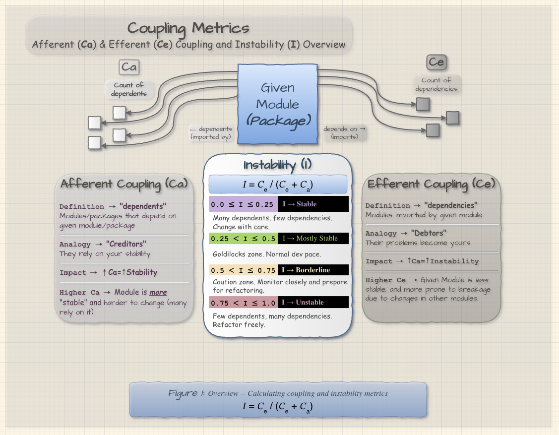
From Ca and Ce we derive a powerful ratio.
𝐼 = 𝐶ₑ / (𝐶ₑ + 𝐶ₐ)
Instability ranges from 0 to 1.
| I Range | Stability | Meaning | Change Strategy |
|---|---|---|---|
| 0.0 ≤ I < 0.25 | Stable | Many dependents, few dependencies | Change with care |
| 0.25 ≤ I < 0.50 | Balanced | Healthy structural position | Normal dev pace |
| 0.50 ≤ I < 0.75 | Borderline | Dependency heavy | Monitor closely |
| 0.75 ≤ I ≤ 1.0 | Unstable | Few dependents, many dependencies | Refactor freely |
The graph below shows how instability changes as Ce grows for different fixed values of Ca.
Low Ca produces curves that rise very quickly toward volatility. Higher Ca dampens that rise, making the same increase in Ce less destabilizing.
This leads to one of the most important architectural principles.
Stable Dependencies Principle
Dependencies should flow toward stability.
unstable modules → stable modules
When stable modules depend on unstable ones, architectural fragility appears quickly.
Instability Curves
The chart above shows how Instability changes as Ce grows for several fixed values of Ca.
A few patterns jump out immediately:
- When Ca is low, instability rises very quickly. Modules with few dependents become volatile with even a modest increase in outgoing dependencies.
- When Ca is higher, the curve climbs more slowly. A module with many dependents can absorb some additional dependencies before drifting into the more unstable bands.
- The
Ca = 0line is the extreme case. A module with no dependents is structurally free to become maximally unstable.
This is why Ce is not the whole story by itself. The same number of outgoing dependencies means something different depending on how much responsibility the module already carries.
Said another way: instability is not merely about how much you depend on — it is about that dependency load relative to who depends on you.
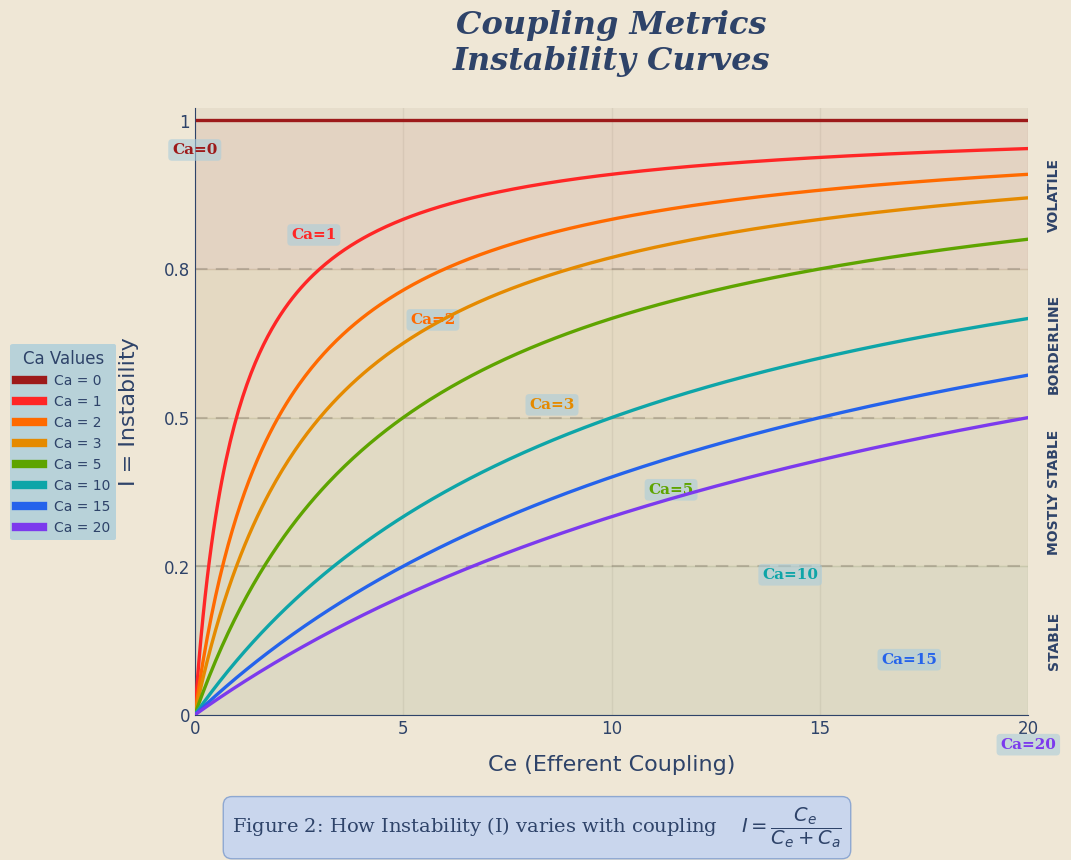
Description (Instability Curves)
The instability curves plot the ratio I = C_e / (C_e + C_a) as the number of efferent couplings (C_e) grows for a series of fixed afferent coupling counts (C_a). Each curve shows how quickly a module will move from stable toward volatile as it accumulates outgoing dependencies. When C_a is small, even a handful of efferent couplings causes I to rise sharply, meaning that leaf modules become unstable very quickly. When C_a is large, the curves climb more gradually — a stable core module with many incoming dependents can tolerate more outgoing dependencies before becoming volatile. In other words, high‑responsibility modules (large C_a) have more structural inertia against instability, while low‑responsibility modules rapidly drift into the volatile region as they add dependencies. The metric I was defined by Robert Martin as the ratio of efferent coupling to total coupling and measures a package’s resilience to change: I = 0 indicates complete stability and I = 1 indicates complete instability.
🧬 Abstractness (A)
This metric differentiates types as concrete or abstract (interface/protocol/port).
A = Na / Nc
Where
Na= number of abstract typesNc=`total number of types
Interpretation
A = 1→ completely abstractA = 0→ completely concrete
Conclusion
- Abstraction provides flexibility
- Concrete code provides behavior
-
Good architecture balances both
🧪 Main Sequence
When plotting Abstractness (A) against Instability (I), something interesting appears.
Healthy modules tend to cluster along a line defined by:
A + I = 1
This line is called the Main Sequence.
The conceptual graph below shows the terrain first:
- the main-sequence line itself
- the Zone of Pain in the lower-left
- the Zone of Uselessness in the upper-right
- a small illustrative distance marker showing how we measure deviation from the line
The key idea is simple: modules do not have to sit exactly on the main sequence, but the farther they drift from it, the more likely they are to be structurally imbalanced.
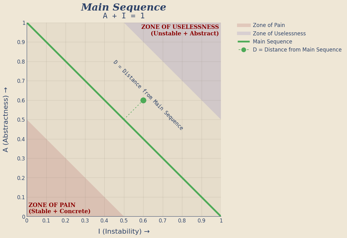
🪨 Architectural Danger Zones
Zone of Pain
low A
low I
Meaning:
concrete AND stable
These modules are depended on by many other modules but contain little abstraction.
Examples often include:
- database schemas
- configuration systems
- foundational libraries
Changing them causes cascading impact.
Hence the name.
Zone of Uselessness
high A
high I
Meaning:
abstract AND unstable
These modules contain abstractions nobody uses.
Example:
12 interfaces
1 implementation
0 dependents
Beautiful architecture.
No real purpose.
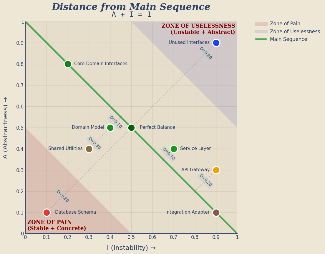
🧪 Distance From the Main Sequence
Once we place real modules on the same chart, the picture gets richer.
The detailed graph below shows:
- the main sequence
- the two architectural danger zones
- example modules in and out of those zones
- a dotted guideline from each module to its nearest point on the main sequence
- the distance value (
D) for the more interesting examples
That lets us see not just where a module sits, but how far off-balance it is.
Some modules live outside the danger zones and are still worth watching. A service layer, API gateway, or shared utility package may not be pathological, but a non-zero distance still suggests the design is drifting away from the ideal balance.
✅ Markdown exported to coupling-article-part1.md
✅ Exported 3 output asset(s)

PosixPath('coupling-article-part1.md')
🗺️ Where These Metrics Apply
These metrics apply to almost any software system:
- microservices
- modular applications
- large monoliths (UI and/or service)
- plugin architectures
-
libraries
- Microservice systems especially benefit from coupling analysis because dependencies often hide behind network calls rather than imports.
- A service with high efferent coupling may rely on many downstream services.
- Each dependency increases operational risk.
- Understanding coupling helps prevent systems from drifting toward the dreaded:
A tightly coupled monolith
🧱 The Takeaway
Architecture is often treated as an art.
But beneath the diagrams lies something more mechanical.
Software systems obey structural forces.
Coupling is one of them.
And like gravity…
you can ignore it.
But you cannot escape it.
📚 References
- Martin, R. C. (1994). OO Design Quality Metrics: An Analysis of Dependencies.
- Martin, R. C. (2017). Clean Architecture.
- Lakos, J. (1996). Large-Scale C++ Software Design.
- Ford, N., Parsons, R., & Kua, P. (2017). Building Evolutionary Architectures.